Colour choices can have a BIG impact on a brand’s packaging, particularly when it comes to how we see and recognise businesses. It can influence your customers’ emotions and behaviours, affecting how they feel about your brand and, therefore, how much they spend.
So, let's take a look at the main principles of colour psychology and what they can mean when it comes to making those all-important packaging decisions.
The power of colour psychology
Basically, colour psychology is the study of how colours affect a customer’s behaviour and decision-making. You know how the colour red instantly makes you think of a sale, right? Or how green makes you think about the environment and sustainability?
Certain colours evoke specific feelings and associations, and customers will remember these experiences and how they made them feel. After all, people are drawn to what makes them feel good and the things that appeal to their values, Abigail Turner MBPsS told us back in 2022 when talking about the psychology behind branding, and similar principles apply to colours.
Your brand will become known for the colours you use on your packaging, making it instantly recognisable for customers, so it’s also vital to choose consistent colours across all your marketing materials (with the occasional additions of sale and seasonal packaging colours, of course).
What psychological impact do different colours have?
Red is a bold colour, often associated with energy, passion, and strength. It’s effective in capturing a customer’s attention and driving impulse buys with its sense of urgency, making it ideal for promotional packaging.
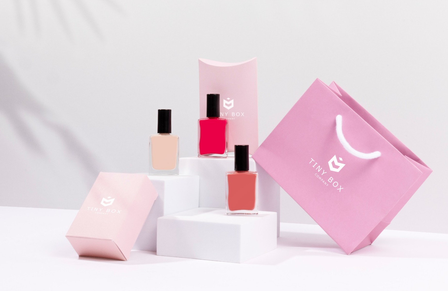
Pink is a colour associated with love, typically linked to femininity, compassion, and romance. This makes it a great choice for products associated with beauty and lifestyle.
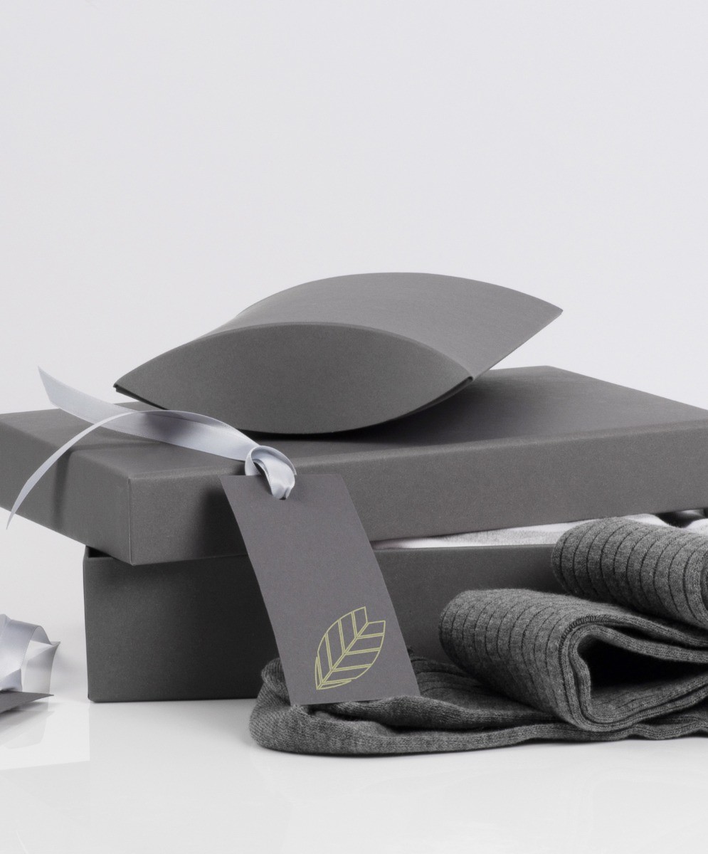
Green is the colour most associated with nature, making it a great choice for sustainable and eco-friendly products. These are particularly important as consumers become increasingly more environmentally conscious.
Orange is another bold choice, and is often associated with warmth and energy. This makes it suitable for brands and products that are fun, dynamic, and creative.
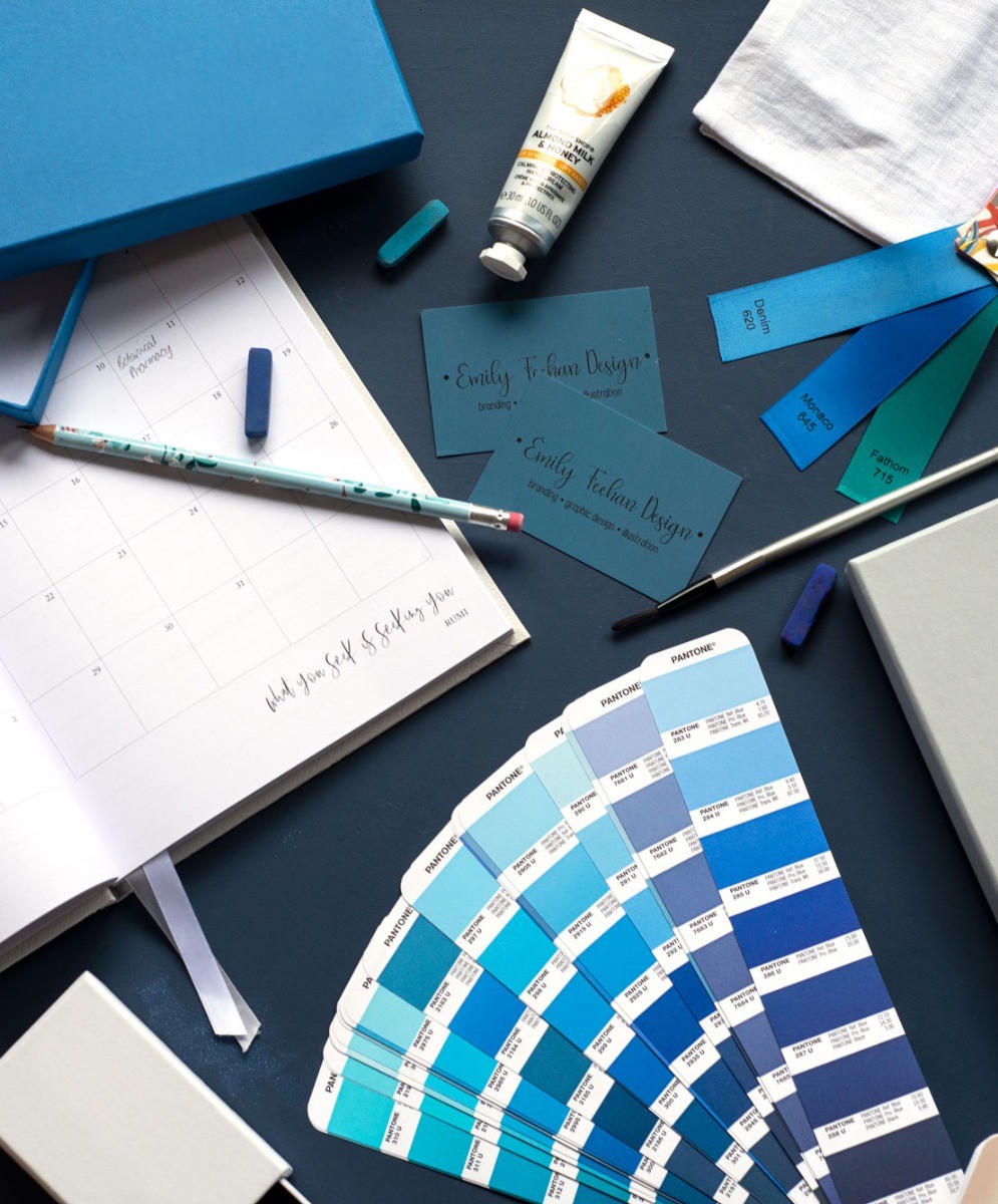
Blue is a colour often linked to trust and reliability. It’s also calming, conveying professionalism and responsibility, and is often used in healthcare products.
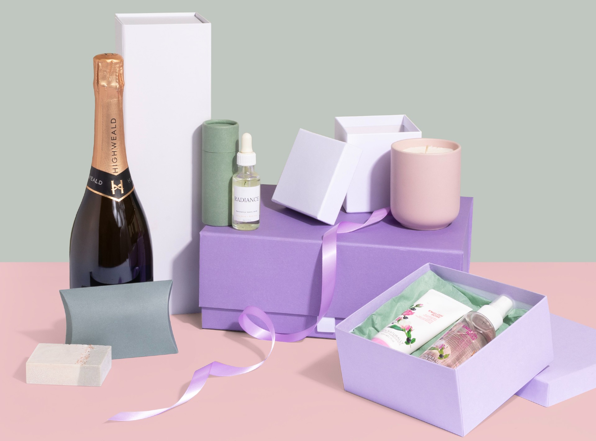
Purple is associated with royalty and wisdom, and can also add a touch of luxury to your packaging. This makes it ideal for brands that want to evoke a sense of sophistication for their products.
Yellow is a bright and cheerful colour, great for grabbing a customer’s attention. It conveys happiness and warmth, making it particularly effective for creating a positive and uplifting experience.
Black is a sophisticated colour choice for packaging, conveying luxury and elegance. It’s often used for high-end products to convey a sense of exclusivity, and can make your product stand out as premium and desirable.
White often symbolises purity and simplicity, and can be great for providing a minimalist and modern look. It’s also often used to convey transparency, keeping your packaging fresh and clean.
Colour psychology and packaging
Colour plays a crucial role in brand identity and recognition, so it’s important to be consistent across all your packaging designs. This isn’t just linked to packaging though - it’s also reflected in logo design, website design, and other marketing materials.
Here are some factors to consider to help you select the right colour palette for your brand:
Brand values
Different colours can evoke different emotions for your customers, so it's important to choose colours that match your brand’s products and values - for example black or purple are good choices for luxury items, while green works well for eco-friendly products. Consistency will also strengthen brand recognition and loyalty, so make sure to use the same colours across all promotional materials.
Target audience
Different age groups and demographics may have different associations with colours. Market research can help when selecting your colour palette, to find out the preferences and perceptions of your customers. Focus groups or surveys can provide feedback on different colour palettes and their impact, helping you to keep up to date on these preferences.
Colour trends
Keep an eye on colour trends in the industry and be willing to adapt. While classic colour associations remain important, staying relevant with specific trends can keep your brand fresh. 2024 has seen the world of sustainable packaging experience a vibrant transformation. Radiant Red, Fondant Pink, Cyber Lime, Apricot Crush, Elemental Blue, Digital Lavender, and Astro Dust are the stars of this year's colour trends, reshaping the look of packaging across industries - check out more on these packaging colour trends here.
Brand psychology
In addition to colours, businesses need to consider brand psychology too. ‘Maximise the details that are important to the consumer in as simple and effortless way as possible,’ said Abigail Turner - identify key messages you want to convey at first glance to the consumer and find a way to make these the primary features of packaging.
Colour psychology and packaging
By understanding and applying these principles of colour psychology, you can create packaging that not only protects your products but also reflects your brand. Whether you want to convey excitement, luxury, or sustainability to your customers, choosing the right colours can make a significant impact on how your brand is perceived.
Browse our full range of packaging solutions at Tiny Box Company, with boxes, bags, tissue paper, ribbon, and more all available in an array of bright and on-trend colours.